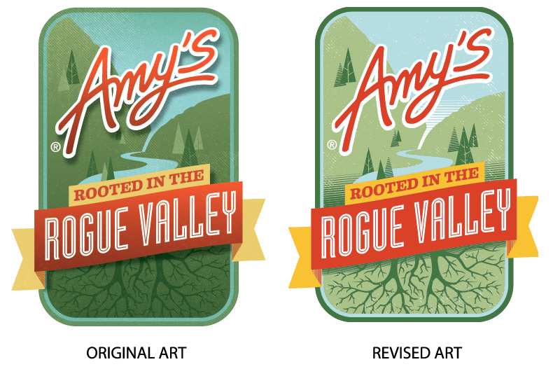
Amy’s Kitchen was the Grand Marshal at the recent Pear Blossom Festival parade in Medford, Oregon, so they designed some very nice t-shirts for their team to wear. The design was so pretty, it was going to require 12 ink colors (those gradations and drop shadows really add up). While that was totally do-able, Amy’s was open to re-working their art to a simpler version for the tees. Still great, less ink, less money, more good.
For this project, we used one of the “Original Bottle Tees” from Earthspun Apparel. In addition to being super-soft and a lovely color, this Water Bottle Blue shirt has a pretty nice pedigree:
“Each Original Bottle Tee™ saves the equivalent of 6.5 20oz plastic bottles from the landfill and 18 quarts of water by eliminating textile dyeing. The Earthspun® colors we offer are derived from recycled bottles and other recycled plastics we use to create our fiber. Green is made from green soda bottles, brown is made from brown beer and root beer bottles. Yes, the plastic beer bottles you get at the ball game or race!, Blue is made from blue water bottles, Grey is made from X-ray films, and black is made from black food trays. The recycled cotton we use is postindustrial waste and the recycled polyester we use is a combination of post consumer and postindustrial waste.”
To keep the tees soft – even after printing – and maintain an eco-friendly footprint, we used water-based inks and discharge for this project. Discharge is when you remove the color from the t-shirt fiber, rather than putting down a white ink under-base. Because discharge only works with cotton fiber, we knew that some of the blue tee color would still be in the shirt because the tee is only 35% cotton, the remainder being recycled plastic water bottles.
Amy’s was advised that there would be some color-shifting on their design and everyone was fine with that.
We were able to get a photo of the finished tee next to a white tee with the same imprint. Everyone likes the blue one better, even though the colors on the white are more true to the design. It’s a nice, unifying, effect when the t-color bleeds a bit into the decoration. In this instance, it also mellowed out the color a bit. Totally groovy.
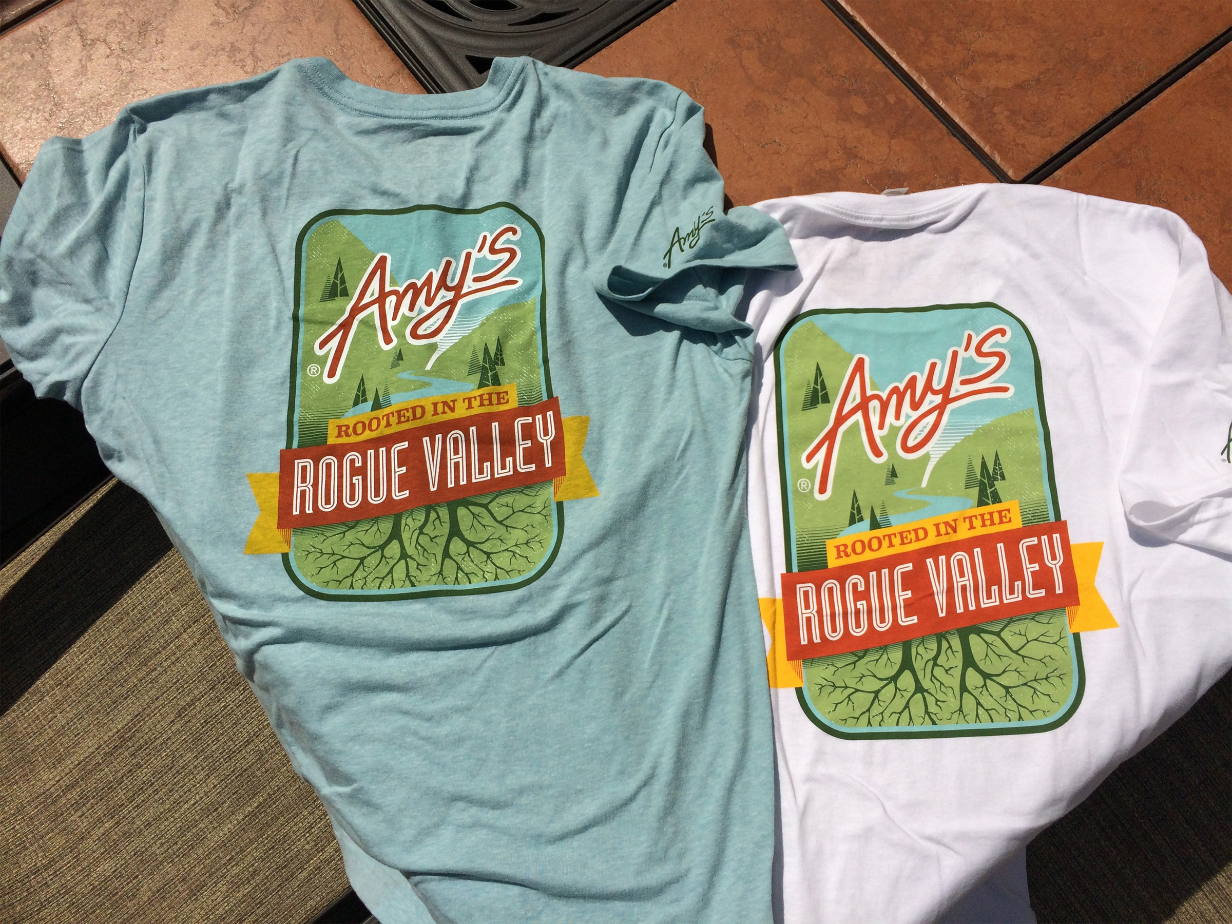
Final design, on the “water bottle blue” tee and an organic white.